
How To Apply the 7 by 7 Rule in PowerPoint?

If your slides feel like a wall of text, you already know the problem. Audiences stop reading after the first two lines, then stop listening to you altogether. The 7 by 7 rule in PowerPoint exists to fix exactly this. It is one of the oldest and most practical slide design rules, and it still works in 2026 because the core issue it solves, information overload, has never gone away.
In this guide, we will break down what the 7×7 rule actually means, why it matters, and how to apply it step by step. We will also show you where a plain bullet list should really be a visual, because that swap is where most of the rule’s benefit comes from.
Whether you are building a client pitch, a quarterly review, or a college presentation, the same principle applies. The rule is not about restricting your content. It is about restructuring it so an audience can absorb it in the few seconds they actually spend looking at each slide.
What Is the 7x7 Rule in PowerPoint? (often called the 7x7 rule)
The 7 by 7 rule is a slide design guideline that limits each slide to a maximum of seven lines of text, with no more than seven words per line. Some versions of the rule use six instead of seven, but the idea stays the same: keep text short enough that an audience can read a slide in seconds, not minutes.
The rule is not a strict law. It is a ceiling. The moment a slide needs more words than that to make its point, the real fix is usually not tighter wording. It is a different slide format altogether, often a chart, icon set, or diagram.
Why the 7x7 Rule Still Matters?
Presentations compete with phones, laptops, and wandering attention spans. A dense slide asks the audience to choose between reading and listening, and most people choose reading, which means they stop listening to you.
The 7×7 rule forces a useful discipline. It pushes you to decide what actually matters on a slide before you open PowerPoint, instead of dumping every thought onto one screen and hoping the audience sorts it out. Slides built this way present better, get remembered longer, and are far easier to skim if they are shared as a leave-behind deck.
It also matters for a newer reason. Recruiters, executives, and clients increasingly skim decks on their phones before a meeting even starts. A slide that only works when read slowly, at full size, on a laptop, fails that first impression.
There is also a memory factor most people overlook. Audiences generally retain visuals far better than blocks of text. A slide that pairs one short idea with a strong visual tends to stick in someone’s mind long after the meeting ends, while a slide packed with seven dense lines often blurs together with every other slide in the deck by the time the presentation wraps up.
How to Apply the 7x7 Rule Step by Step?
Applying the rule is less about counting words and more about rethinking how a slide carries information. Here is a practical sequence to follow.
- Write your full thought first, then cut it. Draft the slide content as a normal sentence or paragraph. Then edit it down to its core message. Most first drafts can lose half their words without losing meaning.
- Count lines and words before you move on. Once a slide is drafted, check it against the limit: seven lines, seven words per line. If it goes over, that is your signal to simplify or split.
- Split dense slides into two or three. A single topic that needs 15 lines of text is really two or three slides pretending to be one. Give each idea its own slide and its own breathing room.
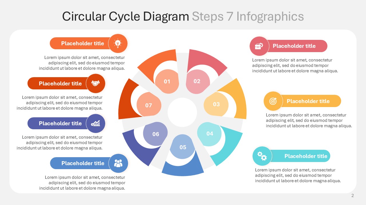
- Turn process or step-based content into a diagram. If you are walking through a sequence, a lifecycle, or a repeating process, a 7-step circular cycle diagram communicates the flow instantly, something a bulleted list of seven steps never manages to do.
- Replace lists with icons wherever you can. A list of services, stages, or categories reads faster as icons with short labels. For operations or supply chain topics, a delivery and logistics icon set says in one glance what a paragraph would take a minute to explain.

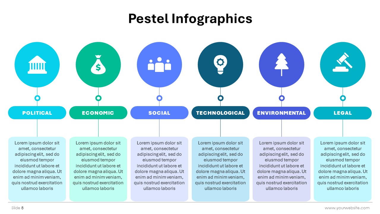
- Convert strategic frameworks into infographics. Frameworks like PESTEL are natural candidates for text overload, since each factor tempts you to write a full sentence. A PESTEL analysis infographic holds all six factors on one slide without breaking the 7×7 rule once.
- Review the deck as a whole, not slide by slide. A slide can pass the word count test and still feel busy next to the slides around it. Step back and check pacing across the full deck before calling it done.
Common Mistakes When Using the 7x7 Rule
The rule is simple, but a few habits quietly break it.
- Shrinking the font to fit more words. This defeats the entire purpose of the rule and hurts readability on top of it.
- Treating every slide as a bullet list by default. Data, comparisons, and processes almost always work better as a chart or diagram than as text.
- Cutting words without cutting ideas. Trimming “we are going to significantly increase” to “we will grow” saves words, but ten shortened ideas on one slide still overwhelm the audience.
- Ignoring visual hierarchy. Seven lines of text in the same size and weight is still hard to scan, even at the word limit.
- Forgetting spacing and white space. A slide can meet the word count and still look crowded if the lines sit too close together or the margins are too tight.
Watch for these patterns as you edit. They are the reason two slides can both technically follow the 7×7 rule while one still feels cluttered and the other feels clean.
When It Is Fine to Bend the Rule?
The 7×7 rule is a guideline, not a hard limit. Detailed reference slides, appendix content, or dense data tables meant for a printed handout can carry more information, because the audience is meant to study them, not glance at them for five seconds during a talk. The rule matters most for slides you present live. Anything meant to be read slowly, later, on paper, can carry more.
Tools That Make the 7x7 Rule Easier to Follow
Most people break the 7×7 rule not because they want long slides, but because they do not have a fast way to build the visual alternative. This is exactly the gap SlidesBrain is built to close. Instead of typing out another bullet list, you can start from a ready-made infographic or diagram and just drop your own content in.
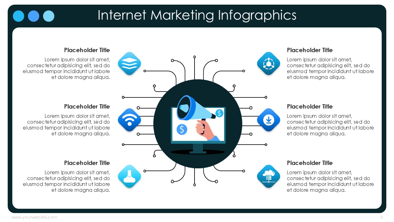
If a slide is data-heavy or growth-focused, an internet marketing infographic template turns metrics and channels into a single clean visual instead of a crowded paragraph.
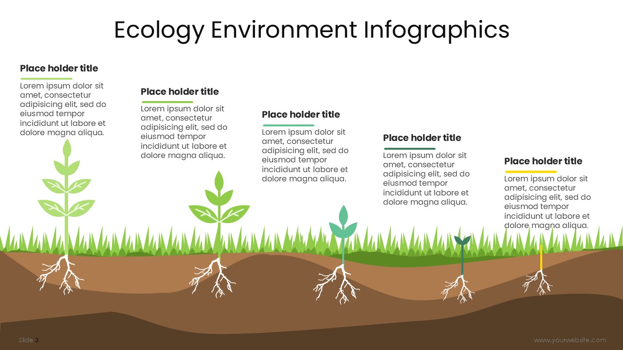
If your topic touches sustainability, climate, or environmental impact, an ecology and environment infographic template gets the message across without a single dense line of text.
The pattern is the same across every use case. Rather than fighting to fit an idea into seven lines, you pick a template built for that exact kind of content, add your text, and the slide follows the 7×7 rule almost automatically, because the design was never built to hold a paragraph in the first place.
Final Thoughts
The 7 by 7 rule is not about counting words for the sake of it. It is a shortcut to slides that people actually read and remember. The real skill is knowing when to trim text and when to swap it for a visual entirely, whether that is a 7-step circular cycle diagram, a PESTEL analysis infographic, or a simple icon set.
If you want to apply the 7×7 rule without rebuilding every slide from scratch, browse SlidesBrain’s presentation templates and start from a design that is already built to keep your message short, clear, and easy to present.
FAQs
Question: Is the 7×7 rule the same as the 6×6 rule?
Answer: They are close cousins. The 6×6 rule caps slides at six lines of six words each, while the 7×7 rule allows one extra line and one extra word per line. Both aim at the same outcome: short, scannable slides.
Question: Does the 7×7 rule apply to slide titles?
Answer: No. The rule is meant for body content. Titles should already be short on their own, usually well under seven words.
Question: What should I do if my content genuinely needs more than seven lines?
Answer: Split it across two slides, or move it into a chart, diagram, or icon-based layout instead of squeezing it into one text-heavy slide.
Question: Does the 7×7 rule work for academic or technical presentations?
Answer: Yes, with adjustments. Keep the live, presented slides within the limit, and push detailed data, citations, or methodology into an appendix section meant for reading rather than presenting.