
The 60-30-10 Color Rule for Slides: How to Choose Presentation Palettes
Quick Answer
The 60-30-10 rule splits your slide colors into three roles. Use a dominant neutral for 60% of the slide (usually the background), a secondary color for 30% (panels, headers, charts) and one accent color for 10% (the one thing you want noticed). It gives every slide a clear hierarchy and keeps your palette calm.
What Is the 60-30-10 Color Rule?
The 60-30-10 rule is a proportion guide. Designers have used it for years in interiors and fashion, and it carries over to slides neatly. The idea is simple. One color leads, one supports, and one punctuates. Nothing fights for attention, so your audience knows where to look.
Think of it as a ratio, not a law. It is a starting point that stops you from using five equal colors and creating visual noise.
Why Does It Work for Presentations?
Slides are read in seconds, often from the back of a room. Color has to do quick work.
- It builds hierarchy. The accent tells viewers what matters before they read a word.
- It reduces clutter. A limited palette leaves room for content to breathe.
- It keeps decks consistent. Fixed roles mean slide 3 and slide 30 feel like one story.
- It speeds up your work. You stop guessing and start assigning.
How Do You Apply a 60-30-10 Slide by Slide?
Assign each share a job. This table shows where each color usually goes.
Share | Role | Where it goes on a slide |
60% | Dominant | Slide background, large empty areas, body text contrast base |
30% | Secondary | Title bars, cards, sidebars, chart bodies, image overlays |
10% | Accent | Key numbers, buttons, highlights, one chart series, icons |
Keep the ratio across the whole deck, not just one slide. A title slide can lean bolder. A data slide should stay quieter.
How Do You Choose a Presentation Palette? (5 Steps)
- Start with your purpose. A board update needs calm and trust. A product launch can carry more energy.
- Pick your 60% neutral. White, off-white, light gray, or a deep charcoal for dark mode. This decides readability.
- Choose the 30% from your brand. If you have a logo color, use it here. It anchors the deck to your identity.
- Add a contrasting 10% accent. Look across the color wheel from your secondary color. Complementary pairs, such as blue and orange, make the accent pop.
- Test on a real screen. Projectors wash out color. Preview your slides on a large display or a projector if you can.
A practical tip: save the three colors as theme colors in PowerPoint or Google Slides. Every new shape and chart then follows the rule automatically.
What Are Some Ready-to-Use 60-30-10 Palettes?
These four combinations work well as starting points. Adjust the hex codes to match your brand.
Style | 60% Dominant | 30% Secondary | 10% Accent |
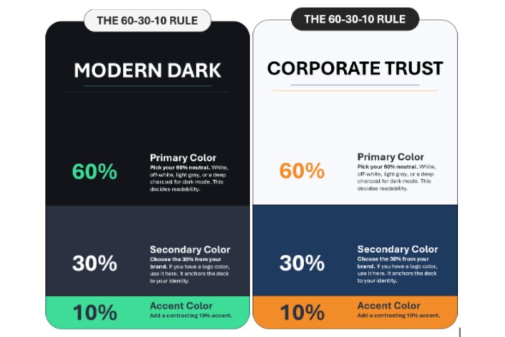
Corporate trust | F7F9FC (soft white) | 1F3A5F (navy) | F28C28 (orange) |
Modern dark | 12141A (near black) | 2B3140 (slate) | 3DDC97 (mint) |
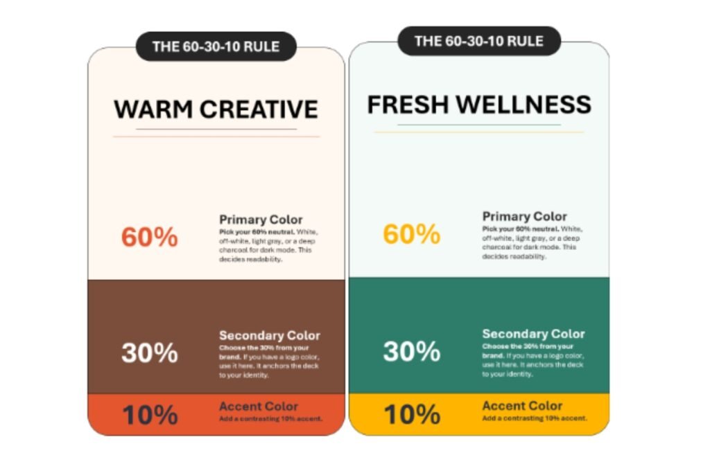
Warm creative | FFF8F0 (cream) | 7A4E3B (clay brown) | E4572E (vermilion) |
Fresh wellness | F4FAF7 (pale green) | 2E7D6B (deep teal) | FFB400 (amber) |
What Does a 60-30-10 Slide Look Like in Practice?
Take a quarterly sales slide using the corporate trust palette.
- 60%: a soft white background with generous margins.
- 30%: a navy title bar, plus navy bars for last quarter’s results.
- 10%: one orange bar for this quarter, and an orange arrow beside the growth figure.
The eye goes straight to the orange. The story, growth, lands in about two seconds. That is the rule doing its job: the accent is the headline, and everything else supports it.
Now imagine every bar in a different color. The viewer has to decode the chart before understanding the message. Restraint is what makes the point visible.
Is Your Palette Accessible? A Quick Contrast Check
Beautiful colors fail if people can’t read them. The Web Content Accessibility Guidelines (WCAG) set a minimum contrast ratio of 4.5:1 for normal text and 3:1 for large text.
I ran the contrast numbers on two palettes above, and they show why testing matters:
- Navy on soft white: 10.9:1. Excellent for body text.
- White on navy: 11.5:1. Excellent for title bars.
- Orange on navy: 4.7:1. Passes, so accents work on the 30% panels.
- Orange on soft white: 2.3:1. Fails for text. Use it for shapes and icons only.
- Mint on near black: 10.4:1. Strong for the dark palette accent.
Color vision matters too. Colour Blind Awareness estimates that about 1 in 12 men and 1 in 200 women have a color vision deficiency. Never rely on red versus green alone. Add labels, icons or patterns.
What Mistakes Should You Avoid?
- Using the accent everywhere. At 25% it stops being an accent and becomes noise.
- Choosing two loud colors. If the 30% and 10% both shout, the slide feels tense.
- Ignoring chart colors. Give the key series the accent and mute the rest in tints of your secondary color.
- Placing text on busy images. Add a solid secondary-color overlay for legibility.
- Treating the numbers as exact. Nobody measures pixels. Aim for the feel of the ratio.
When Should You Break the Rule?
Sometimes the rule is too tidy. Data-heavy slides may need extra colors for categories. A brand with a strict multi-color identity may need a wider palette.
Even then, keep the spirit. One color leads, the others support, and a single element stays loudest. Use tints of your main colors before adding new hues.
60% Base. 30% Support. 10% Wow. Let SlidesBrain Do the Color Math.
Great slides don’t start with fancy graphics, they start with the right colors. The 60-30-10 rule gives your deck a balanced, professional look, but applying it slide after slide can eat up hours. That’s where SlidesBrain comes in. Explore a library of professionally designed PowerPoint and Google Slides templates with polished, ready-to-use color palettes so your dominant, secondary, and accent shades already work in harmony.
- Business PowerPoint Template & Google Slides Template: No. 1 template for business reports, future prediction presentations, sales growth, and more.
- Pitch Deck PowerPoint and Google Slides Templates: Best for investors, seed fund rounds, startups, and business pitches.
- SlidesBrain Free PowerPoint Templates: Explore all the free templates for business presentation, education, sales pitches, and more.
- SlidesBrain Future of Aviation Technology Sustainability Electric Aircraft PPT And Google Slides: Ideal for presenting future business goals, and technology awareness.
- Enterprise Architecture Why Do Enterprises Need 5G Presentation PPT and Google Slides: Ideal for business entrepreneurs to deliver remarkable presentations with best orientation.
- Startup Marketplace Pitch Deck PPT Template and Google Slides: Good for early stage startup and seed fund raising presentation.
Skip the guesswork, keep your brand consistent, and let your message take center stage. Dominant backgrounds, supporting content, and bold accent touches fall neatly into place, making every slide look intentional. Whether you’re pitching investors, teaching a class, or presenting quarterly results, SlidesBrain helps you turn a colorful idea into a confident, standout presentation. Ready to design smarter? Discover your perfect template today at SlidesBrain.
Frequently Asked Questions
Question: Does the 60-30-10 rule apply to dark-mode slides?
Yes. Make the dark shade the 60%, use a slightly lighter slate as the 30% and keep a bright accent for the 10%. Watch text contrast closely.
Question: Do white and black count as colors?
Neutrals usually count as the 60%. Body text in black or dark gray is small enough to sit outside the ratio.
Question: How many colors should a presentation use?
Three main colors, plus tints and shades of them. Charts may need a few more, but keep them controlled.
Question: Can I use the rule with brand guidelines?
Yes. Put your primary brand color at 30% and a neutral at 60%. Reserve a secondary brand color for the 10%.
Question: What is the fastest way to test a palette?
Squint at the slide. If the eye lands on your key message first, the palette works. Then check contrast with a WCAG tool.