
How to Create a Business Plan Presentation in PowerPoint

To create a business plan presentation in PowerPoint, open a new file, choose a clean slide layout, and build it around ten core sections: title, problem, solution, market analysis, business model, marketing plan, competition, team, financial projections, and the task. Keep each slide focused on one idea, use visuals over paragraphs, and end with a clear call to action for investors or stakeholders.
That covers the short version. But a business plan presentation only works if it convinces someone to act, whether that’s an investor writing a check, a bank approving a loan, or your own leadership team backing a new initiative. Below is a complete walkthrough of what to include, how to structure it in PowerPoint, and where most first-time decks go wrong.
Business Plan vs. Business Plan Presentation
A written business plan is a detailed document, often 15 to 40 pages, covering every operational and financial detail of your company. A business plan presentation is a condensed, visual version built to be presented out loud in 10 to 20 minutes. It hits the same points but leans on charts, short bullet points, and a clear narrative instead of dense paragraphs.
Investors and executives rarely read a full plan before a meeting. The presentation is often their first real exposure to your idea, so it needs to stand on its own.
Step 1: Set Up Your PowerPoint File
- Open PowerPoint and select a blank presentation, or start from a business-focused template if you want a head start on design.
- Go to the Design tab and set your slide size. Widescreen, 16:9, is the standard for most business presentations today.
- Pick a simple color palette, ideally two to three colors that match your brand, and apply it consistently through Slide Master so every new slide stays on-theme automatically.
- Choose one or two fonts. A clean sans-serif like Calibri, Inter, or Helvetica reads well on screen and in print.
Setting this up before you add content saves time later. It also means you won’t end up manually reformatting every slide once you’ve already built the deck.
Most successful business plan presentations follow a similar sequence. Here’s the structure worth building your deck around.
- Title Slide.
Company name, tagline, your name and title, and the date. Keep it visually simple. This slide sets the tone for everything that follows.

- The Problem.
State the problem your business solves in one or two sentences. Use a statistic or short customer scenario to make it concrete rather than abstract.

- The Solution.
Explain what you offer and how it solves the problem you just described. A product screenshot or simple diagram works better here than a paragraph of text.

- Market Analysis.
Show the size of your target market and who’s in it. A single chart with your total addressable market, serviceable market, and target segment communicates this faster than any bullet list.

- Business Model.
Explain exactly how you make money. Pricing, revenue streams, and unit economics belong here. Keep the numbers simple and round.

- Marketing and Sales Plan.
Outline how you’ll reach customers and convert them. Cover your main channels and any early traction you already have, like signups, pilot customers, or partnerships.

- Competitive Landscape.
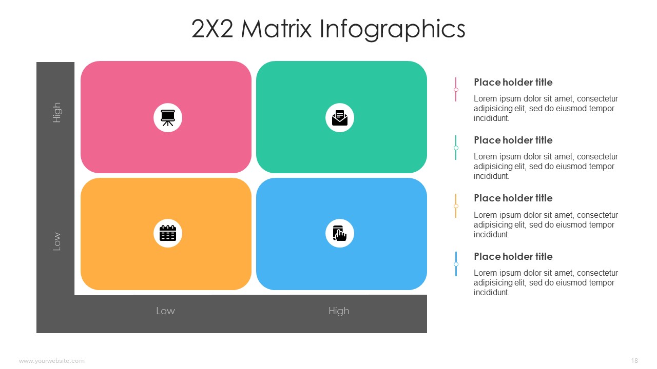
Use a simple 2×2 matrix or comparison table to show where you sit relative to competitors. Be honest about competitors. Investors notice when a slide claims there aren’t any.
- Team.
Photos, names, titles, and one line of relevant background per person. This slide builds credibility, so keep it focused on experience that matters to this business.


- Financial Projections.
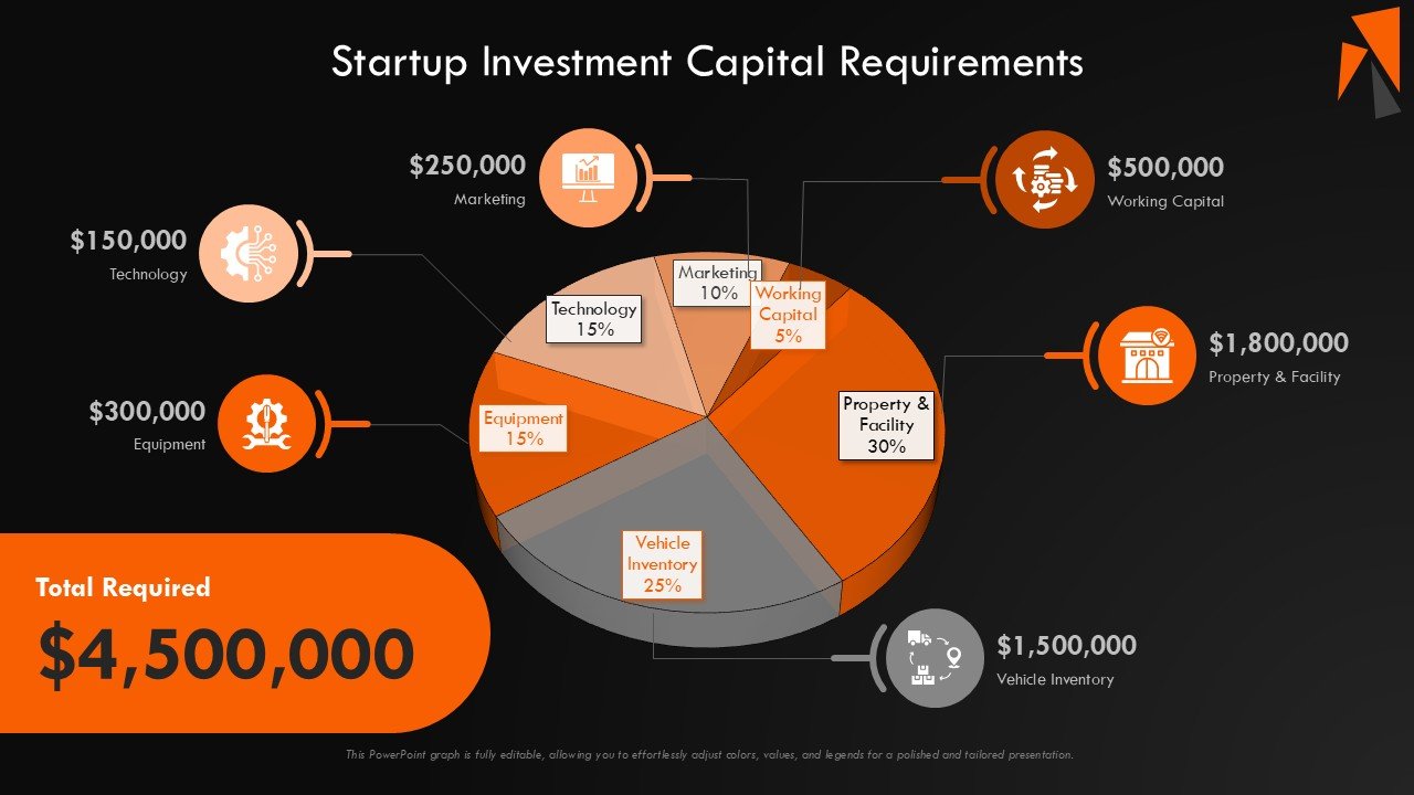
A three-to-five-year forecast covering revenue, costs, and profitability. A single line or bar chart communicates the trend faster than a spreadsheet dropped onto a slide.

- The Ask.
Close with what you need, whether that’s funding, a partnership, or internal approval, and what it will be used for. End with contact information so the next step is obvious.
Step 3: Design Slides People Actually Read
Structure gets your content in the right order. Design determines whether anyone absorbs it.
- Limit each slide to one core idea. If a slide needs a scroll to read in your head, it needs to be split into two.
- Use charts instead of tables wherever you’re showing a trend. A rising line communicates growth faster than a grid of numbers.
- Keep text to short phrases, not full sentences. You’re the narrator. The slide is a visual aid, not a script.
- Use consistent icon and color styles across every slide. Mismatched visual styles are one of the fastest ways a deck reads as unpolished.
- Leave white space. A crowded slide is harder to follow than one with room to breathe.
This is also where your starting template matters more than people expect. A well-structured business template already has consistent spacing, chart styles, and typography built in, so you’re filling in content instead of solving layout problems from scratch.
If you’re building this from zero, it’s worth starting from a template designed specifically for business plans rather than a generic deck. SlidesBrain’s PowerPoint templates include layouts built for exactly this kind of structure, with slots for market charts, team bios, financial graphs, and competitive matrices already laid out. It cuts down the design work significantly, so you can spend your time on the content and the story instead of fighting with alignment and fonts.
Step 4: Add Charts and Financial Data the Right Way
Financial slides make or break credibility. A few practices keep them clean.
- Use PowerPoint’s native chart tool rather than pasting an image from Excel. Native charts stay editable and look sharper on screen.
- Round numbers for the slide. Save exact figures for the appendix or the written plan behind the presentation.
- Label your axes and include units directly on the chart, so it can be understood without narration.
- Stick to one chart type per data story. Mixing bar, line, and pie charts across a single financial section makes the deck harder to follow.
Step 5: Rehearse the Narrative, Not Just the Slides
A business plan presentation is a spoken story supported by slides, not a document read aloud. Practice explaining each slide in your own words without reading directly off the screen. If you find yourself needing to read a slide word for word to remember what it means, that slide has too much text on it.
Time yourself. Most investor pitch presentations run 10 to 15 minutes, with time left over for questions. If your rehearsal runs long, look for slides that repeat information already covered elsewhere.
Common Mistakes to Avoid
Too much text. Dense paragraphs signal that the presenter hasn’t distilled their own idea yet. Cut every slide down to its essential point.
No clear ask. Decks that end without a specific request leave the audience unsure what to do next. Always state exactly what you want.
Inconsistent formatting. Mixed fonts, colors, or spacing between slides make a deck feel rushed even when the underlying content is strong.
Ignoring the competition slide. Skipping competitors, or claiming you have none, undermines trust faster than almost anything else in the deck.
Overly optimistic financials. Projections that assume everything goes perfectly read as inexperience. Show a realistic base case, and mention upside separately if asked.
Building the Deck for Different Audiences
The same ten-section structure works for most audiences, but the emphasis shifts depending on who’s in the room. Investors care most about market size, the business model, and the task. Bank loan officers focus more heavily on financial projections and cash flow stability. Internal leadership teams often want more detail on execution timelines and resource needs, since they already understand the market.
It’s worth keeping one master version of the deck with every section fully built out, then trimming or reordering slides for each specific audience rather than rebuilding from scratch each time. Duplicate the file, remove what’s not relevant, and adjust the emphasis of your opening slides to match what that audience is evaluating.
Final Thoughts
A strong business plan presentation isn’t about cramming in every detail from your written plan. It’s about choosing the right ten slides, telling a clear story across them, and backing it up with visuals that do the explaining for you.
If design is the part slowing you down, starting from a ready-made deck solves most of that problem before you open PowerPoint. SlidesBrain has business presentation templates built specifically for plans like this, with the structure, charts, and layout already in place. You bring the strategy and the numbers, and the template handles the rest.
Frequently Asked Questions
How many slides should a business plan presentation have?
Most run between 10 and 15 slides for the core pitch, with additional slides held in an appendix for questions that come up during discussion.
What’s the ideal length for presenting a business plan?
Ten to fifteen minutes for the main presentation, leaving time afterward for questions. Longer pitches tend to lose audience attention before the financial section.
Should I include detailed financials on the slides?
Show summarized trends and headline numbers on the slide itself. Keep detailed spreadsheets in a backup appendix or the written business plan you share separately.
Can I use a PowerPoint template for a business plan presentation?
Yes, and it’s usually a better starting point than a blank file. A template built for business content already has the right slide types, chart placeholders, and consistent formatting in place.