
How to Create Grid & Modular Layouts in PowerPoint Slides
Creating a PowerPoint presentation that looks professional is not only about choosing attractive colors, fonts, or images. How you arrange content on each slide also has a major impact on readability and visual consistency. This is where grid and modular layouts in PowerPoint can help.
A grid gives you an organized structure for positioning text, images, charts, icons, and other visual elements. A modular layout takes this idea further by dividing the slide into flexible content blocks or modules. Together, these approaches make presentations easier to design, scan, and understand.
Whether you are creating a business presentation, pitch deck, marketing presentation, project report, or educational presentation, using a grid-based structure can help you create cleaner and more balanced slides.
What Is a Grid Layout in PowerPoint?
A grid layout is a visual framework that divides a PowerPoint slide into rows, columns, margins, and alignment points. These invisible guides help you position different elements consistently.
Anatomy of a Grid
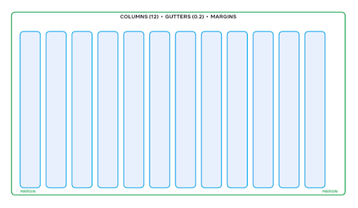
For example, a slide can be divided into:
- Two equal columns for text and an image
- Three columns for comparing products or strategies
- Four columns for presenting key statistics
- Multiple rows for organizing a timeline
- A combination of columns and rows for complex information
The grid itself does not normally appear in the final presentation. Instead, it acts as a design guide that helps you maintain spacing and alignment.
A well-designed grid can prevent common problems such as uneven margins, misaligned objects, excessive empty space, and overcrowded content.

What Is a Modular Layout in PowerPoint?
A modular layout divides a slide into separate content blocks, or modules. Each module can contain a specific type of information, such as a statistic, heading, image, chart, quote, or short explanation.
For example, a business presentation could use four modules:
- Market size
- Growth opportunity
- Customer segment
- Competitive landscape
Each module has its own visual area while still following the overall grid of the slide.
The advantage is flexibility. Modules can be resized, rearranged, or combined depending on the information you need to communicate.

For example-
- 2×2 Matrix Module

2 . 3-column feature grid

3 . Bento Box / Card Modular

4 . Dashboard modular

Why Use Grid and Modular Layouts in PowerPoint?
A structured layout makes it easier for audiences to understand the relationship between different pieces of information.
- Improve Visual Organization
A grid provides a clear structure for placing content. Instead of positioning elements randomly, you have predefined areas for each component.
- Create Consistency
Using the same grid across multiple slides helps create a consistent presentation design. Headings, images, charts, and text blocks can follow similar alignment rules throughout the deck.
- Make Slides Easier to Scan
Audiences often scan presentation slides before reading them in detail. Modular blocks create visual separation, allowing viewers to quickly identify important information.
- Simplify Complex Information
Large amounts of information can become easier to understand when divided into smaller modules. This is particularly useful for business reports, strategic frameworks, market analysis, and project presentations.
- Speed Up Slide Design
Once you establish a grid, you do not have to decide from scratch where every element should go. The framework gives you a starting point for each new slide.
How to Create a Grid Layout in PowerPoint?
You can create a grid manually using PowerPoint’s built-in guides and alignment tools.
Step 1: Define Your Slide Margins
Start by deciding how much space you want around the edges of the slide.
Avoid placing important text or graphics too close to the slide boundaries. Consistent margins create a cleaner visual frame.
Step 2: Turn On Guides and Gridlines
Open the View tab in PowerPoint and enable Guides and Gridlines. Guides provide reference lines for positioning objects, while gridlines help you understand the overall spacing of the slide. You can also add additional guides when you need more columns or rows.
Step 3: Divide the Slide Into Columns
Determine how many columns your slide requires.
A simple two-column structure can work well for:
- Text and image layouts
- Problem and solution slides
- Before-and-after comparisons
- Executive summaries
Three- or four-column grids can work better when presenting multiple categories, metrics, or options.
Step 4: Establish Consistent Gaps
The space between columns and content blocks is called a gutter.
Keep gutters consistent. If one section has a small gap while another has a large gap, the slide can look unbalanced even when all elements are technically aligned.
Step 5: Align Objects to the Grid
Select multiple objects and use PowerPoint’s alignment tools under Shape Format > Align.
Useful commands include:
- Align Left
- Align Center
- Align Top
- Align Middle
- Distribute Horizontally
- Distribute Vertically
These tools can save time and help maintain consistent spacing.
How to Create a Modular Layout in PowerPoint?
Once your grid is established, you can turn individual grid areas into content modules.
Start With the Main Message
Before creating modules, determine what the slide needs to communicate.
For example, if the slide explains a company’s growth strategy, the modules might include:
- Current position
- Growth drivers
- Strategic initiatives
- Expected outcomes
Each module should contribute to the central message rather than simply fill empty space.
Give Each Module a Clear Purpose
A module should ideally communicate one idea. Avoid putting several unrelated points into the same block. Short headings, concise descriptions, numbers, icons, and supporting visuals can make modules easier to understand.
Create Visual Hierarchy
Not every module needs to have the same visual weight. You can make an important statistic larger than supporting information or give the primary module more space.
For example, a 2×2 modular layout could contain one large key metric occupying two grid sections while three smaller modules provide supporting insights.
Keep Module Styles Consistent
Use consistent:
- Padding
- Border treatment
- Typography
- Heading sizes
- Icon styles
- Corner treatments
- Spacing
Consistency helps separate modules without making the slide look fragmented.
Grid vs. Modular Layout: What's the Difference?
Although the terms are related, they serve different purposes.
Grid Layout | Modular Layout |
Provides an underlying structure | Uses content blocks within that structure |
Focuses on alignment and spacing | Focuses on grouping information |
Can be invisible | Modules are usually visually identifiable |
Helps position objects | Helps organize content |
Supports overall slide consistency | Supports information hierarchy |
In practice, the two approaches work together. The grid provides the structure, while modules organize the content.


Best Practices for Grid-Based PowerPoint Design
A grid can improve your slides, but using too much structure can also make them feel rigid. Keep these principles in mind.
Keep the Grid Simple
You do not need a complicated grid for every presentation. Start with two, three, or four columns and add complexity only when necessary.
Use White Space Intentionally
Do not try to fill every grid cell. Empty space gives content room to breathe and can make important elements more noticeable.
Avoid Overloading Modules
A modular design should simplify information, not turn every section into a miniature paragraph.
Keep text concise and use visual elements where they add meaning.
Maintain Alignment
If the left edges of headings, text blocks, and graphics are aligned, the slide will usually feel more organized.
Design for Content, Not Decoration
A grid should support your message. Avoid adding boxes, lines, or modules simply because the slide has empty space.
Use PowerPoint Templates to Build Faster
Creating a grid from scratch for every presentation can take unnecessary time. A professionally designed PowerPoint template can provide ready-made structures that you can adapt to your content.
SlidesBrain offers presentation templates and professionally designed slides that can help you build structured presentations without starting with a blank slide.
Ideal for business reports, strategy presentations, marketing decks, pitch presentations, and other professional use cases.
Ideal layout for seed fund round, investor presentation, and fundraising presentation.
Massive library of free PowerPoint templates for business, education, pitch-deck, sales-pitch, and more.
Examples of Grid and Modular Slide Structures
Different types of information can benefit from different grid structures.
Two-Column Layout
Use one side for the main explanation and the other for an image, chart, or supporting data.

Best for: executive summaries, problem-solution slides, and product overviews.
Three-Column Layout
Divide the slide into three equal sections, with each section representing a different idea.

Best for: strategic priorities, business models, product features, or comparison slides.
Four-Module Layout
Use a 2×2 structure to present four related insights.

Best for: market analysis, key findings, business metrics, and strategic frameworks.
Asymmetrical Modular Layout

Use one larger module alongside several smaller modules. Check out this template
Best for: highlighting a primary statistic while providing supporting information.
Common Mistakes to Avoid
Even a grid-based presentation can look ineffective if the underlying design decisions are poor.
- Using too many columns: More columns do not automatically create better organization.
- Ignoring hierarchy: Giving every module equal size and emphasis can make it difficult to identify the most important message.
- Inconsistent spacing: Uneven gaps between modules can make a slide appear unfinished.
- Too much text: A modular layout is not a reason to place large paragraphs inside every box.
- Decorative grids: Lines and boxes should have a purpose. If they do not improve understanding, remove them.
Final Thoughts
Grid and modular layouts provide a practical way to bring structure to PowerPoint presentations. A grid helps control alignment, spacing, and consistency, while modular design helps divide complex information into understandable sections.
The key is to use structure without making the presentation feel rigid. Start with a simple grid, establish consistent spacing, create a clear hierarchy, and use modules only when they improve the way information is communicated.
If you want to save design time, professionally designed PowerPoint templates from SlidesBrain can provide a strong starting point. Instead of building every layout from scratch, you can customize an existing structure around your content and presentation goals.
Frequently Asked Questions
What is the best grid size for a PowerPoint slide?
There is no single best grid size. A two- or three-column grid is often sufficient for simple business slides, while more complex information may require a four-column or modular grid.
How do I show gridlines in PowerPoint?
Go to the View tab and enable Gridlines. You can also enable Guides to create alignment references for your slide elements.
What is a modular slide layout?
A modular slide layout divides content into separate visual blocks. Each block communicates a specific idea while following a consistent overall structure.
Should every PowerPoint slide use a grid?
Not necessarily. Grids are useful when you need alignment, consistency, or structured information. Some slides, such as full-screen visual slides or title slides, may benefit from a simpler composition.
Are PowerPoint templates useful for grid layouts?
Yes. Professionally designed templates can provide pre-built layouts, spacing systems, and visual structures that reduce the time required to design slides from scratch.