
Top 10 Best Font Pairings for Modern PowerPoint & Google Slides
Your slides can have great content and still lose the room. The culprit is often typography. Mismatched fonts make a deck look rushed. The right pairing makes it look designed.
Choosing fonts for PowerPoint and Google Slides should not take an hour. You need one heading font, one body font, and a clear reason for each. That is what this guide gives you.
Below are the 10 best font pairings for modern presentations, each with its best use case, recommended sizes, and a quick tip. You will also find setup steps for both tools and a ten-minute action plan. For the fastest result, combine these pairings with pre-designed slides from SlidesBrain and skip the blank-slide stage entirely.
Understand Why Font Pairing Matters?
Fonts shape how your audience reads and remembers your message. A weak pairing makes slides feel cluttered. A strong one creates clear hierarchy and builds trust.
Good pairings follow five rules:
- Use two fonts only. One for headings, one for body text.
- Create contrast. Pair a serif with a sans serif, or a bold display font with a neutral one.
- Keep it readable. Body text should stay at 18 pt or larger.
- Match the mood. Corporate, creative, and academic decks need different voices.
- Stay consistent. Set fonts once at the theme level, not slide by slide.
Top 10 Font Pairings Every Presentation Designer Must Know
| Sr No | Pairing | Style | Best For |
| 1 | Montserrat + Open Sans | Clean, corporate | Business decks |
| 2 | Playfair Display + Source Sans 3 | Elegant, editorial | Brand and luxury decks |
| 3 | Poppins + Inter | Modern, techy | Startup and SaaS pitches |
| 4 | Oswald + Lato | Bold, punchy | Keynotes and sales decks |
| 5 | DM Serif Display + DM Sans | Refined, contemporary | Reports and portfolios |
| 6 | Space Grotesk + IBM Plex Sans | Techy, analytical | Data and product decks |
| 7 | Georgia + Calibri | Safe, universal | Shared and offline decks |
| 8 | Nunito + Roboto | Friendly, soft | Education and training |
| 9 | Raleway + Merriweather | Light, readable | Text-heavy presentations |
| 10 | Bebas Neue + Work Sans | Bold, creative | Events and creative pitches |
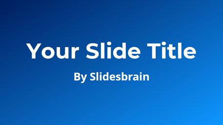
1. Montserrat + Open Sans
Best for: Corporate presentations, company profiles, quarterly reviews.
Montserrat gives headings a strong geometric presence. Open Sans keeps paragraphs easy to read on any screen. It is a dependable pairing when you need a professional look without risk.
Try it: Montserrat Bold at 40 pt, Open Sans Regular at 20 pt.
2. Playfair Display + Source Sans 3
Best for: Brand storytelling, luxury products, and editorial-style decks.
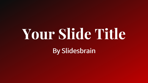
Playfair Display brings high-contrast elegance to titles. Source Sans 3 stays neutral underneath so the design never feels heavy.
Try it: Use Playfair for titles and pull quotes only. Keep all body copy in Source Sans 3.
3. Poppins + Inter
Best for: Startup pitch decks, SaaS demos, product launches.
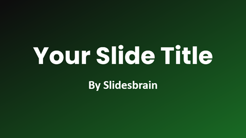
Both fonts are clean and geometric. Poppins adds personality to headlines. Inter is built for screen clarity, so small text stays sharp.
Try it: Poppins SemiBold at 38 pt, Inter Regular at 18 to 20 pt.
4. Oswald + Lato
Best for: Keynotes, sales decks, conference talks.
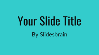
Oswald is condensed and tall, so it fits big statements on one line. Lato softens the page with a warm, open body style.
Try it: Set Oswald in uppercase for section headers. Keep body text in sentence case.
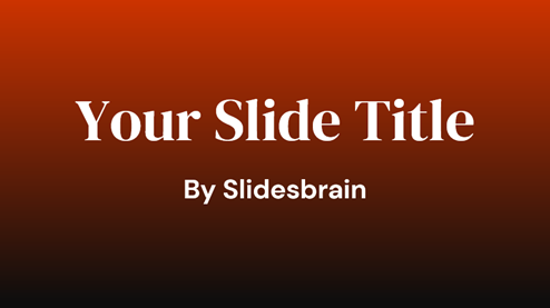
5. DM Serif Display + DM Sans
Best for: Annual reports, portfolios, agency decks.
These two share a design family, so they blend naturally. The serif adds character. The sans-serif keeps everything modern and tidy.
Try it: DM Serif Display at 44 pt for cover slides, DM Sans at 20 pt for content.
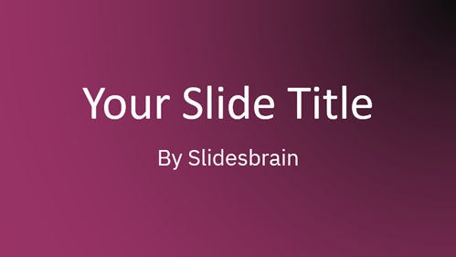
6. Space Grotesk + IBM Plex Sans
Best for: Data reviews, product roadmaps, technical presentations.
Space Grotesk has a distinct, forward-looking feel. IBM Plex Sans handles numbers, labels, and chart text with precision.
Try it: Use IBM Plex Sans for every chart label so data slides stay consistent.
7. Georgia + Calibri
Best for: Decks shared across teams, clients, and older devices.
Both fonts are widely available, so your slides rarely break when opened on another computer. Georgia adds a classic serif touch. Calibri keeps body text compact and clear.
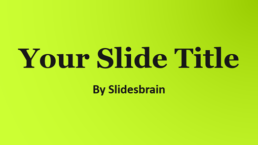
Try it: Georgia Bold at 36 pt, Calibri at 20 pt. This is your safest default.
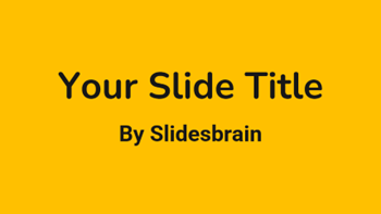
8. Nunito + Roboto
Best for: Lessons, workshops, onboarding, training decks.
Nunito has rounded edges that feel approachable. Roboto adds a neutral, familiar reading experience.
Try it: Nunito Bold at 36 pt for slide titles, Roboto at 22 pt for classroom readability.
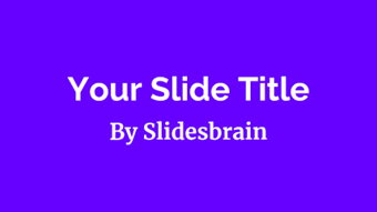
9. Raleway + Merriweather
Best for: Research summaries, consulting decks, text-heavy slides.
Raleway looks light and modern in headings. Merriweather is designed for comfortable reading at small sizes, which helps when slides carry more copy.
Try it: Raleway Medium at 34 pt, Merriweather Regular at 18 pt.
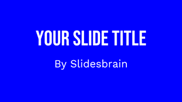
10. Bebas Neue + Work Sans
Best for: Event decks, creative pitches, campaign presentations.
Bebas Neue is all caps and impossible to ignore. Work Sans keeps supporting text calm and clear.
Try it: Limit Bebas Neue to short titles of five words or fewer.
How to Apply Font Pairings in PowerPoint and Google Slides?
PowerPoint:
- Install the free fonts from Google Fonts on your computer.
- Open View, then Slide Master.
- Go to Slide Master, then Fonts, then Customize Fonts.
- Set your heading and body fonts, then save the theme.
- Before sharing, go to File, then Options, then Save, and select Embed fonts in the file.
Google Slides:
- Open Slide, then Edit theme.
- Select the master slide.
- Choose your heading and body fonts. Use More fonts to add any Google Font.
- Close the theme editor. Every slide updates at once.
Font Mistakes to Avoid
- Using three or more typefaces. It signals a lack of design control.
- Pairing two similar fonts. Two near-identical sans-serifs look like a mistake, not a choice.
- Shrinking text to fit more content. Cut words instead.
- Using decorative fonts for body copy. Save them for one or two headline words.
- Skipping the check on another device. Missing fonts cause layout shifts.
Do This Today: Fix Any Deck in 10 Minutes
Your deck does not need a full redesign. It needs two fonts and ten focused minutes. Take these steps now:
- Pick one pairing from the list above. Match it to your audience, not your taste.
- Set both fonts in the Slide Master or Theme. Do it once. Never format slide by slide again.
- Set your size scale. Titles at 36 to 44 pt. Body at 20 pt. Captions at 14 pt minimum.
- Delete every extra font. Use Find and Replace Fonts in PowerPoint to clean up stragglers.
- Cut the text by a third. Shorter lines let your fonts do their job.
- Preview on a second device. Confirm nothing shifts before you present.
Want to skip the setup? Open a pre-designed template from SlidesBrain, swap in your chosen pairing at the theme level, and drop in your content. The layouts, spacing, and structure are already done for you.
Start with Pre-Designed Slides from SlidesBrain
Fonts are only one layer of great slides. Layout, color, and spacing matter just as much. SlidesBrain offers free and premium PowerPoint templates and Google Slides themes built for real presentations.
Browse options for:
- Pitch Deck PowerPoint & Google Slides Templates: This template is ideal for startups and investor meetings, specifically for business pitches.
- Business PowerPoint & Google Slides Templates: Ideal for reports, proposals, and reviews
- Artificial Intelligence PowerPoint & Google Slides Templates: 100% editable presentation template designed specifically for tech-oriented presentations.
Every template is fully editable. Change the fonts, colors, and images to match your brand, then present with confidence.
Final Thoughts
Great typography is simple. Choose two fonts that contrast well, set them once, and keep your sizes consistent. Then let a strong template carry the structure. Start with a pairing from this list, open a SlidesBrain template, and build your next deck in half the time.
Frequently Asked Questions
What is the best font pairing for PowerPoint?
Montserrat + Open Sans is a top all-round choice. It is clean, professional, and easy to read on screens and projectors.
How many fonts should a presentation use?
Two. One for headings and one for body text. A third is only acceptable for a single accent, such as a logo or quote.
What are the best fonts for Google Slides?
Google Slides supports Google Fonts, so Poppins, Inter, Lato, Roboto, and Playfair Display all work well. Use the More fonts option to add them.
Can I use Google Fonts in PowerPoint?
Yes. Download them from Google Fonts, install them on your device, and restart PowerPoint. Embed them in the file before sharing.
What font size is best for presentations?
Use 36 to 44 pt for titles and 18 to 24 pt for body text. Avoid anything below 14 pt.
Where can I find pre-designed slides with modern layouts?
SlidesBrain offers free and premium templates for both PowerPoint and Google Slides across business, education, pitch, and creative use cases.