
Step-by-Step Guide: How to Present B2B SaaS Predictive Analytics to Your Board
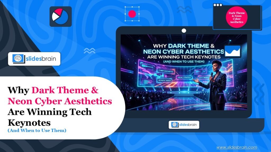
Walk into any major tech keynote this year and you will notice a pattern before the speaker says a word. The stage lights dim. The screen turns black. A single line of neon blue or violet cuts across it, and the logo glows like it is powered by something alive. This is not an accident. Dark themes and neon cyber aesthetics have become the default visual language for tech announcements, and there is real reasoning behind why they work, along with real risk in using them badly.
This piece breaks down why this look has taken over keynote stages and slide decks, when it genuinely helps a presentation land, and when it quietly undermines the message instead.
Why Dark Theme Took Over Tech Keynotes?
It Was Built for Screens, Not Paper
Traditional slide design grew out of print and projector habits: white background, dark text, safe and legible. But most keynotes today are watched on OLED phone screens, laptop displays, and large LED walls, not projected onto a screen in a lit room. On those displays, a true black background costs less power to render and creates sharper contrast against bright accent colors. The result is a slide that looks more like a piece of glass with light behind it than a printed page. That shift in viewing medium is arguably the biggest reason dark themes became the norm rather than the exception.
It Signals ‘Technical’ Without Saying It
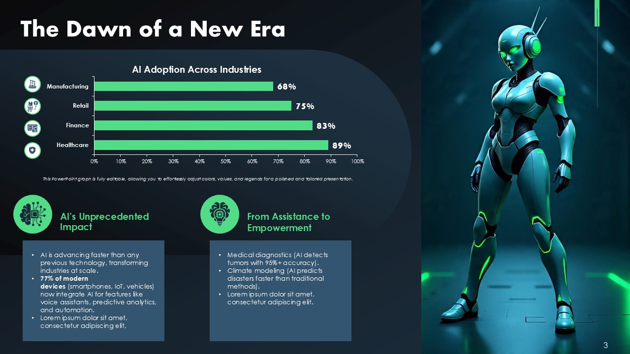
Dark interfaces have been associated with software, code editors, terminals, and developer tools for over a decade. Anyone who has used a modern IDE, a command line, or a dashboard built for engineers has been trained to associate black backgrounds with precision and technical depth. When a keynote opens with a dark neon futuristic roboaesthetic PPT presentation template, it borrows that association instantly. The audience reads competence and modernity before a single data point appears.
It Photographs and Streams Better
Keynotes are not just for the room anymore. They are clipped, streamed, screenshotted, and shared across social feeds within minutes. Dark slides with a bright focal point crop well, hold attention in a small thumbnail, and stand out in a feed dominated by white UI screenshots. A speaker’s face lit against a black backdrop with a glowing product render is simply more shareable than the same shot on a plain white slide.
What Neon Cyber Aesthetics Actually Signal?
Neon accents, usually electric blue, magenta, violet, or acid green, did not start on keynote stages. They came from gaming interfaces, cyberpunk film design, and synthwave visual culture. Borrowing that language sends a specific message: this cybersecurity neon presentation template is forward-looking, fast, and built for people who live online. That is exactly why AI companies, gaming brands, and consumer electronics firms lean on it so heavily. It is shorthand for innovation that would take paragraphs to say in text.
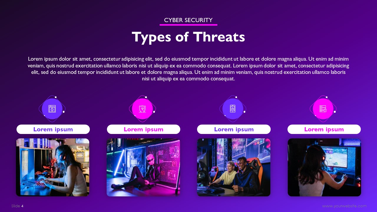
The catch is that neon works because it is used sparingly. A single glowing accent line against deep black draws the eye exactly where the speaker wants it. Flood the same slide with five neon colors and the effect collapses into visual noise. The restraint is the technique, not the color itself.
When Dark and Neon Genuinely Works?
- Product launches and reveals, where you want maximum drama around one hero image or spec.
- AI, SaaS, and developer-tool keynotes, where the audience already associates dark UI with credibility
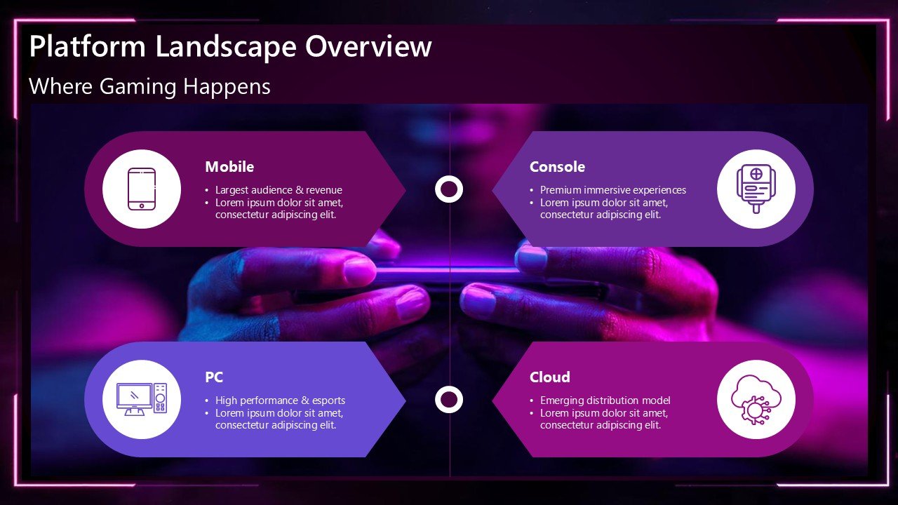
- Gaming and consumer electronics events, where energy and spectacle matter more than formality. In such instances, dark theme or neon theme gaming industry PPT presentation template works best.
- Investor pitches for tech-forward startups, when the brand itself is genuinely built around innovation
- Conference talks on data, security, or infrastructure, where a dark background makes charts and code snippets easier to read on a big screen
When It Is Not Applicable?
Dark theme is not a universal upgrade, and treating it like one is where a lot of decks go wrong.
- Financial and Board Reporting: Dense tables and dollar figures lose readability fast on dark backgrounds, especially when printed or exported to PDF.
- Healthcare, Legal, and Government Presentations: Audiences in these settings associate the aesthetic with entertainment or gaming rather than trust and authority
- Long-Form Training or Education Content: Dark theme increases eye strain over a 45-minute session in a way most presenters underestimate
- Rooms with Strong Ambient Light: A dark slide loses contrast fast under office fluorescents or daylight, which is why so many ‘dark mode’ keynote slides look muddy on a projector instead of an LED wall
- Teams Without a Strong Color Discipline: Neon without restraint reads as amateur rather than futuristic
How to Use the Look Without It Looking Like a Template?
The mistake most people make when they try to copy this style is going all neon, all the time. A cleaner approach follows a simple ratio: one dominant near-black background, one neutral supporting tone such as dark grey or navy, and a single accent color reserved for the thing you actually want the audience to remember. That could be a headline number, a product name, or a call to action.
Typography matters just as much as color here. Dark backgrounds need slightly heavier font weights than light ones, because thin strokes can visually vibrate against high contrast. Leave more white space than feels natural. Cluttered dark slides read as chaotic far faster than cluttered light ones do.
Accessibility deserves a direct mention too. Pure black backgrounds with pure white text can cause halation and eye strain for some viewers, particularly on large screens. A near-black such as a very dark charcoal or navy, paired with an off-white text color, keeps the aesthetic while staying easier to read for a full session.
Building the Look Without Starting From Zero
This is exactly the kind of design decision where a good template library saves real time. Instead of hand-building contrast ratios and accent systems from scratch, SlidesBrain’s style-focused presentation templates already carry that dark, high-contrast structure with the color restraint built in, so the accent placement, spacing, and typography are handled before you type a single word of content.
For teams putting together a keynote on a tight timeline, SlidesBrain’s AI-powered future of artificial technology presentation tool can also generate a first draft of the slide structure and layout, which is a faster starting point than building a dark cyber theme slide by slide in a blank deck. It is a practical way to get the aesthetic right without needing an in-house design team for every launch.

A Quick Pre-Keynote Checklist
- Does the audience already associate dark UI with your category (dev tools, AI, gaming)? If not, treat it as a stylistic choice, not a default.
- Is the room lit, projected, or streamed? Match your contrast plan to the actual viewing conditions.
- Do you have exactly one accent color doing the heavy lifting, or are you using three and hoping it reads as ‘vibrant’?
- Will this deck get exported to PDF or printed for follow-up? If yes, build a light-mode version of the key slides too.
- Have you tested contrast for accessibility, not just for how it looks on your own monitor?
The Bottom Line
Dark theme and neon cyber aesthetics are winning keynote stages because they match how people actually consume tech content now: on screens, in clips, in categories where the audience already trusts a technical visual language. Used with restraint, the look signals innovation instantly. Used without a plan, it just looks like every other AI pitch deck from the last two years.

The difference between the two usually comes down to preparation, not talent. A well-structured template, a disciplined color ratio, and an honest read of your audience will do more for a keynote than any amount of neon glow on its own.
Frequently Asked Questions
Is dark theme better for all tech presentations?
No. It performs best for product reveals, developer audiences, and consumer tech brands. Financial, legal, and formal B2B settings usually still read better in light theme.
What neon colors work best for a cyber aesthetic?
Electric blue, violet, and magenta are the most common because they hold strong contrast against near-black backgrounds without competing with each other. Stick to one as the true accent and use the rest sparingly, if at all.
Does dark theme hurt slide readability?
It can, if pure black is paired with pure white text or if the deck is overloaded with dense tables. A near-black background with off-white text and generous spacing solves most readability issues.
What is the fastest way to build a dark cyber-style deck?
Starting from a pre-built dark or style-themed template is faster and more consistent than designing contrast and accent systems from a blank slide. SlidesBrain’s template library is a practical starting point for this specific look.