The Ultimate Guide to Choosing the Right Text Size for Google Slides
Presentation for businesses remains a standard tool to present future plans, investment opportunities and targeting audiences. No matter how worthy information you have presented in slides, if your font size and visual graphics don’t align or seem awful, you lose your audience’s attention. It is evident that an ideal font size ensures that your content is clear, comprehensible, and visually appealing.
However, many individuals either overuse multiple font sizes or use small font sizes, which creates distraction for the readers and even dominates the actual content. So, what is the ideal font size? Considering the challenges in selecting the right font size, we have written this detailed guide that will walk you through the process of selecting the right text size in Google Slides. Whether you’re delivering a business presentation, an educational lecture, or a creative pitch, this ultimate guide is best written for you.
Importance of Choosing Right Font Size for Google Slides
Choosing the right font size is the first step of designing an easy-to-read presentation. Keeping the ideal size of font can make slides presentable, classic and eye-catchy.
- Font size ensure that audience remain hooked to your presentation.
- Ideal font size can set the harmony in presentation
- Unusual font size can divert the attention of audience towards different alignment.
- Too small or too large font size make your Google slides cluttered and overly written.
General Rules to Choose the Right Font Size for Google Slides
For professionals in finance and accounting, diagrams and graphics are likely to be crucial components of our presentation. Presentation designing platforms, such as SlidesBrain can helps to effortlessly produce appealing graphics with minimal effort. Here, you get endless graphic styles, and visual elements for conveying information in an alluring way. Moreover, by adding graphics, you can concentrate on pinpointing the most significant data in a distinctive manner without overpowering your presentation with words. The audience seldom examines all the specifics regarding the graphic of the rows shown on the left slide during a presentation. The graphics available on the website are easy to use and anyone can easily incorporate these visual elements without hassles.
Change Bulleted Lists To Graphical Elements.
What typeface is most appropriate in a presentation? One that is fully legible to your intended audience. It is very important that each person can clearly see the main content of your presentation, thus always choose font size that are most readable from a distance.
In the process of designing a presentation for an audience Google Slides or PowerPoint, it is essential to take into account “Will this font look appropriate on the screen?” Ask yourself. If you are not certain, it is better to exclude one and find another. In addition, you can follow the below listed tips.
Standard Font Size
Once you have set the font size, ensure to choose the right font style. Be sure to choose only one type of font style for the entire presentation. This gives a symmetric look to your presentation and makes it more presentable. For instance, if you are choosing calibri style, then keep the entire presentation font style calibri. However, if you are choosing the arial, then ensure to keep the presentation font style to arial.
Consistent Font Style
It is generally agreed that business presentations made using PowerPoint should maintain a high level of professionalism. Thus, it becomes necessary to include videos that are in line with the business presentation theme. In addition, also look for PowerPoint templates which indicate places for the video. Although videos have the potential to be effective, remember that it is equally important not to overcrowd your presentation with too many of them.
Ensure that the Audience, Theme, and Design are in Harmony
Before choosing a model or beginning to build your presentation, ask yourself a few things. What will be the main topic of my presentation? These two concepts assist you in focusing on the overall design. The presentation’s components must all be adjusted for the intended audience. Giving lessons in front of your child’s primary school will set your typeface and color scheme apart if your primary goal is a university course.
Keep the Selection of Typographies to a Minimum
A maximum of three typefaces should not be used in a single presentation to maintain design consistency! The listener will become distracted if you use too many various typefaces since they won’t understand how you are structuring the information or the points you want to highlight.
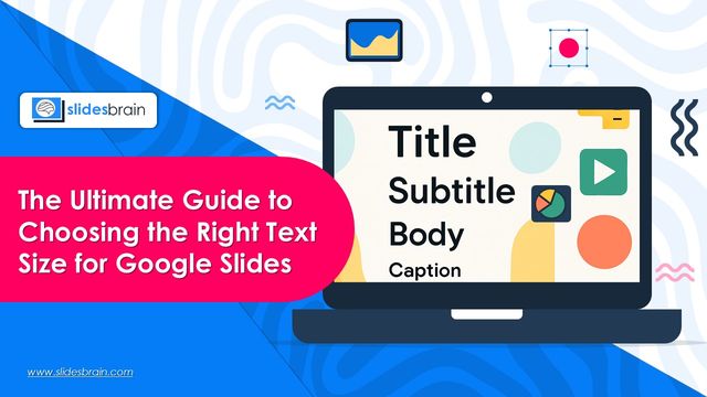
During the design stage, give each typeface a specific function while utilizing your favorite presentation editor. For instance, you can decide to use one of your three favorite font styles for titles, another for subtitles, and a third for the body of the text.
Combine Various Text Weights
Google Slides and PowerPoint provide various features for selecting the ideal text formatting. It is advisable to adjust the text weight to emphasize a specific word or concept. Remember that not all information is essential. To avoid overcrowding your slides with excessive text, it’s important to condense your content. Focus on highlighting the main ideas and points you want your audience to retain.
Be Careful When Selecting Colors
If you use a color that is invisible against the background, what good are the ideal fonts? A presentation needs to be viewed from a suitable distance and in the anticipated amount of light, as we have already mentioned.
These standards should be followed while choosing colors: They must match the design of the template. Select hues that go well with your presentation’s general design or that are consistent with your brand. However, if your template is minimalist with darker slides, make sure to avoid bright and vibrant colors. Always adhere to the specified color schemes if the design is more vibrant.
Contrast is critical. So, the color of the text should be such that it is easily readable from a distance. You should avoid using white text on a grey backdrop. Avoid using colors that contrast too much, though, as this might make the design unappealing.
Make a Hierarchy in Your Visuals
Are all the components of a presentation equally important? Of course not! Section titles, subheadings, numerical data, definitions, explanatory data, results, comments, quotations, and many other sorts of writing can all be found on a single slide, depending on its intended use.
Use different font sizes to highlight certain passages of text by making them larger. Readers can be guided through your content hierarchy by using a variety of font sizes to highlight key text parts. However, kerning—the distance between letters—is just as important as size in maximizing intelligibility and aesthetic appeal.
Conclusion
Google Slides uses text size as a communication tactic rather than just a style decision. Your message will be noticed, read, and retained if you choose the appropriate sizes for your titles, subtitles, and body material. Whether you’re giving a training, pitch, or important report, make sure your writing is both bold and manageable enough to be understandable. However, if you still have doubts, then visit SlidesBrain. The website has been designed sophisticatedly for business presentations, research and university presentations. Each Google slide you get on the website is highly customized to meet your presentation goal. Moreover, you can also get the expert advisory to make your content more impactful and presented in Google slides.